
E-CommerceOptical
How a contact lens side project went from afterthought to $568K run rate
A side project to their in-person optometry practice, this brand had great products and loyal word-of-mouth customers, but no way to be found online. In six months, a coordinated SEO, content, UX, and brand program turned their website into a real revenue engine competing with national names.
INDUSTRY Contact lens ecommerce
•
TIMEFRAME 6 months
•
SCOPE SEO, Content, UX, Brand, & Product Presence
The results
11.5X
monthly order volume
+3,258%
revenue
+740%
traffic
$568K
run rate, from $17K
2.4X
order value
The Challenge
This is a story we love, because it was not a Fortune 100 brand with endless resources. It was a family business whose website had taken the back burner to the optometry practice, and the brand fundamentals were already strong. Quality products, solid fulfillment, and genuinely excellent customer service, all carried over from a business built on word-of-mouth and referrals. When they launched a website to sell contact lenses online, none of that translated, because nothing about the site was built to showcase the brand, to be found, or to convert.
Product pages were created one at a time as suppliers released new items, carrying only the bare minimum information. The articles section was labeled “news” only because that was the template’s default, and it functioned as an accidental blog. The content itself was written by real experts, but it was tangled with keyword cannibalization, duplicate pages, and thin, unfocused material. And the out-of-the-box WordPress navigation gave visitors little reason to explore or buy.
The expertise was all there. It just was not structured to perform.
Why this was such a good fit
This was the perfect split of expertise. We know marketing, websites, and brands. They know optometry and contacts. Bringing that knowledge online was the missing piece, and it was where our partnership approach was able to truly shine.
Our Approach
Before touching the website, we spent time understanding the business itself, its history, goals, strengths, and the qualified staff behind it. That context shaped every decision that followed, and it is the reason the work felt like theirs rather than a template dropped on top of them.
From there we ran a deliberate, balanced program across four fronts at once – technical SEO, content, user experience, and product presence. The sequencing mattered: we spread effort across all four so improvement was continuous and visible, and so resources always went to the highest-impact work rather than one big bet.
Technical SEO: the foundation
We worked within the team’s capacity to ship the fixes that mattered most, and were candid about the few that resourcing on the client’s side would not allow – and that’s okay. We were able to adapt and get several key items implemented.
What we did get through was substantial:
- Global schema for articles, organization, webpage, and product
- A full information-architecture revision to fix crawlability and indexation
- Internal linking and a rebuilt main navigation
- Image and video optimization across the domain
- Meta and sitemap cleanup
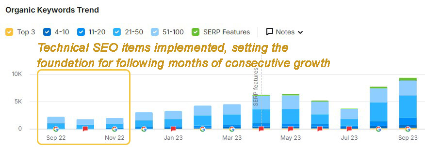
The payoff came before a single new article was published. As soon as the foundation was fixed, the existing content began to climb.
Figure 1
Content Strategy: the reach
We replaced the accidental blog with a real strategy, built from audience research and the brand knowledge we had gathered. The content calendar accounted for search intent across informational, consideration, and transactional stages, plus relevancy, topic clustering, and where each piece fit in the buyer’s journey.
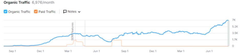
Because their best content came from expert staff, we built the whole pipeline around that expertise. We created briefs that made it easy for their doctors to share what they knew, then handled everything downstream ourselves: publishing on optimized templates, custom fields to surface E-E-A-T signals, and layouts that structured each piece for readers and search engines alike. Their knowledge in, a finished, optimized page out. New content began publishing around the first of December, and the traffic followed almost immediately.
Figure 2
User Experience: the conversion
Traffic means nothing if the site does not convert it. The starting experience was not broken, just generic, an out-of-the-box WordPress setup with little to guide a visitor through the site. We aligned with the client up front that they were open to bigger changes, so we mixed larger redesigns with steady smaller improvements:
- Homepage redesign guidance
- Product-detail and product-listing template redesign guidance
- A rebuilt main navigation
- An information-architecture change that split the old catch-all “news” section into a guided education hub and a separate “industry updates” area for launches and notices
- Significantly expanded product attributes, putting more information on each product page, connected to many of the article topics so users can easily answer questions and be more informed
- In-article secondary navigation to surface infographics and video
We measured it all through time on page, scroll depth, clickmaps from the client’s Hotjar install, and conversion-funnel metrics. Conversion rate optimization and A/B testing came later, and that sequencing was deliberate: we agreed the first six months should be about getting the site current on best practices before layering testing on top of a foundation that was still moving.
Product Presence: selling beyond the website
This brand did not manufacture their own lenses, they resold major contact brands, which meant they were often listing the exact same products as their competitors. When everyone is selling an identical item, the product listing itself becomes the only edge, so we made theirs the best one on the shelf.
We restructured their product data and optimized their Google Merchant Center configuration, then aligned product attributes across every channel they sold on. Consistent, complete, high-quality representation everywhere a shopper might find them. The result was listings that simply presented the product better than competitors offering the same thing, turning a commodity catalog into a genuine advantage.
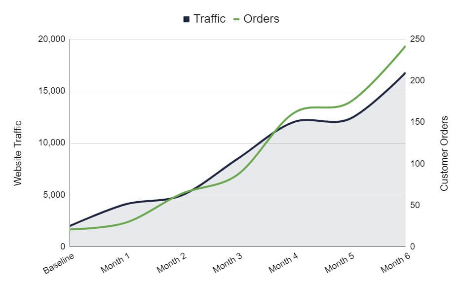
Orders grew from 21 in their best month to date to 242 unique customer orders in month six, while average order value climbed from just over $80 to over $195. Together, that drove 33.6X monthly revenue, taking the business from a $17K to a $568K annual run rate in six months.
Figure 3
The Throughline Was Always Brand
None of this was really four separate projects. Every front we worked was also brand-building, and that was deliberate. A supplier-driven side project became a recognized, trusted name that customers come back to, and that is what drove the lifetime-value gains sitting underneath every headline number.
The technical and content work gave real eyecare professionals a credible platform to author from and put their credentials in front of shoppers. The product listings we structured across channels did not just describe items, they represented the brand consistently everywhere someone might encounter it. Genuine customer reviews were solicited and surfaced, operations and QA were made more transparent, and their presence grew on social and YouTube. Each piece reinforced the same thing: this is a business worth trusting.
By the end of six months, a business that had always taken the back burner was competing directly with big-name brands, and weighing a full-time commitment to what had started as a side project.
This was not a Fortune 100 brand with endless resources. It was a family business that had taken the back burner. In six months, we put it on the map and turned its website into a real part of the business.
Every figure in this case study comes from the client’s own CRM, ecommerce platform, and analytics. For privacy, we do not disclose the brand name.